Refreshing the Vega Website

2020 Vision
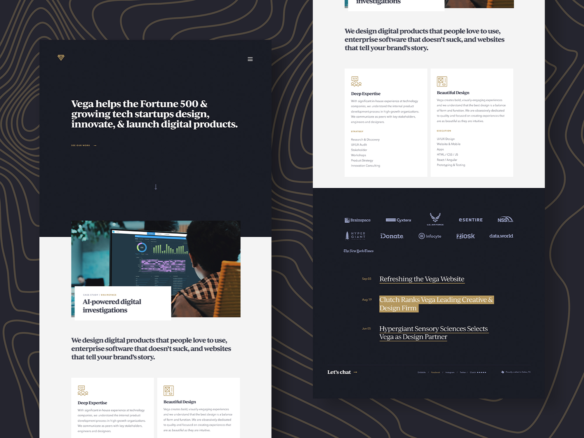
It’s been a little over a year since we launched Vega, and what a year it has been! We have been extremely fortunate thus far to work with several excellent clients on exciting projects. And, as with anything new, it has also been a challenging and refining process.
Building momentum in the early months can be stressful. For a while, our client profile was essentially “Do they have an immediate need and some money?” Our go-to-market strategy was, “Say yes.” Fortunately, this stage was short-lived (knock on wood) as our personal networks began hearing about what we were doing and we started seeing more referral business.
Once we gained some footing and got some successful projects under our belts, we faced some new opportunities and challenges. For example, we found ourselves in a position to be more selective about the type of clients with whom we wanted to work. That led to the realization that we didn’t have clarity on our ideal client profile, which meant we weren’t communicating it effectively on our website either.
Suddenly, we looked at our first website (the one we were so proud of launching in 2018), and like true designers, we hated everything about it.
The shoemaker's children have no shoes
It was high time for a redesign and to clarify who we are, what we're great at, and why you would want to work with us. Easier said than done! As any growing agency can tell you, it's a significant challenge to find time to design your own website when you're doing work for clients.
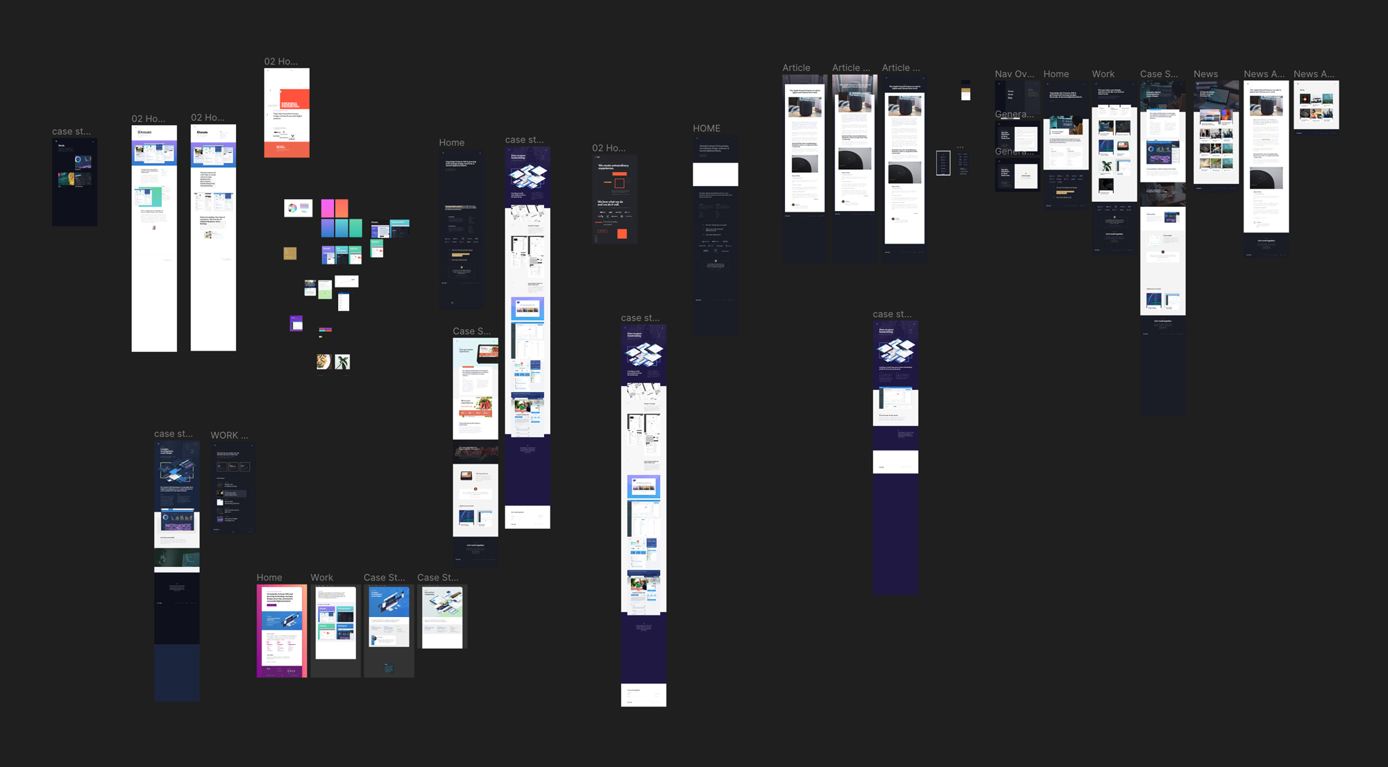
We decided to set aside Fridays for internal products and projects, including our new website. We chose Kirby as our CMS, and got to designing.

The 3 Sentence Marketing Promise
Seth Godin talks about a “3 Sentence Marketing Promise.” He said that every company should be able to articulate the following:
My product is for people who believe ____.
I will focus on people who want ____.
I promise that engaging with what I make, will help you get ____.
This was a great framework for crystallizing our unspoken expectations and clarifying the message we wanted to project.
Who do we want to work with?
The above exercise manifested the following answers, resulting in the site you’re on now.
- Our “product” is for people who believe high-quality product design is worth investing in.
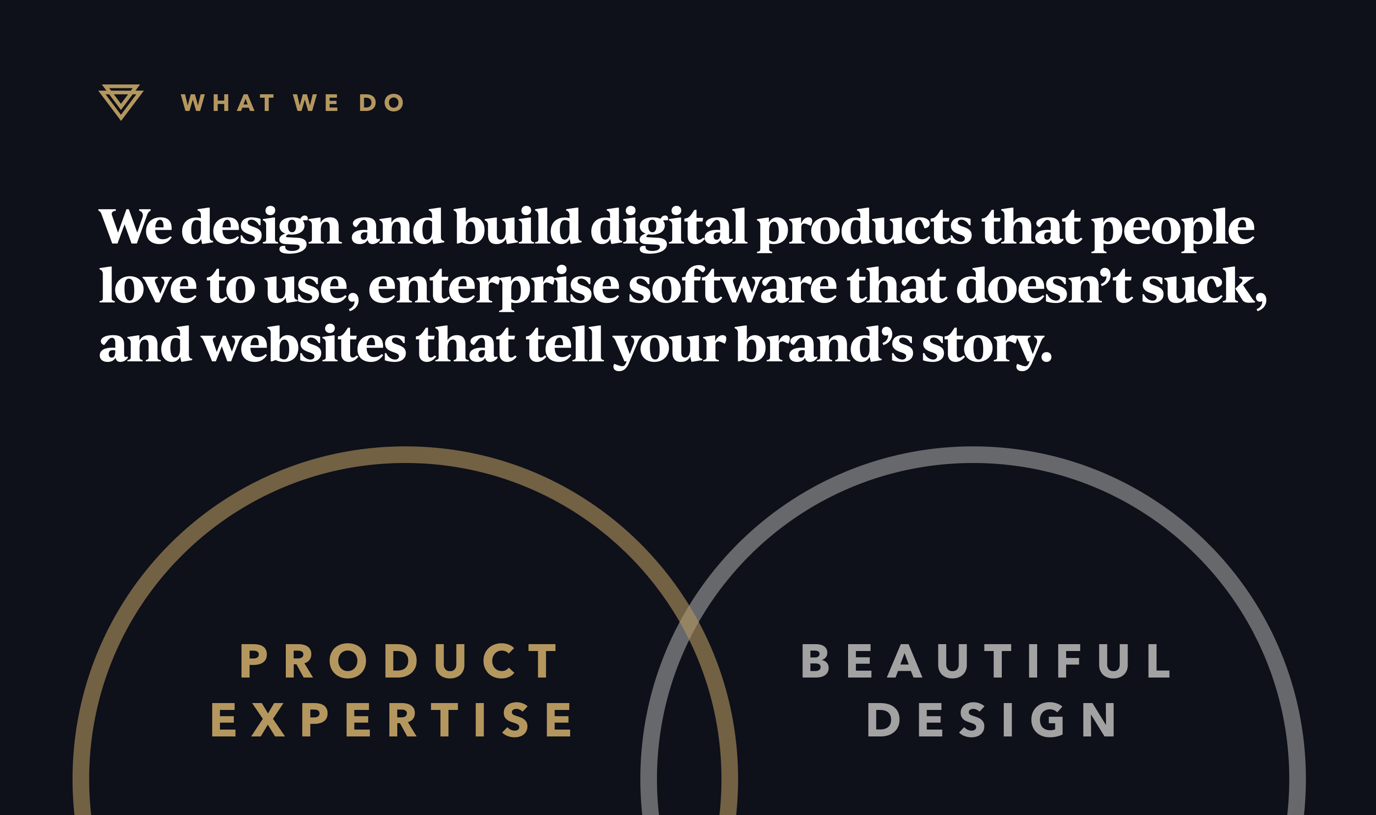
- We will focus on people who want products that people love to use and enterprise software that doesn’t suck.
- We promise that engaging with us will help you acquire, delight, engage and retain customers.
We wanted to say this on our site, but more importantly, we wanted to show it in the form of case studies, which our previous site lacked.
Why Vega?
Case studies and client testimonials go a long way toward selling our expertise. We hope to show that we obsess over the details, provide some of the best UX and UI design in the industry, and that we do our research and make our decisions very deliberately.

Onward
And so, a new era of Vega begins.
We are excited (and relieved) to launch this latest iteration of our online presence, and we appreciate you visiting. Be sure to catch up on some of our recent work or check out what some of our clients have to say on Clutch.
Lastly, whether you want to work with us or just say, “Hello,” we’d love to hear from you.
written by
Jacob Morse
Jacob is Managing Partner at Vega where he specializes in product marketing, strategy and user experience. He loves solving complex problems, good conversation, good books, and lots of coffee.